“We designed a brand identity for Kids and Tutors, an educational platform focused on connecting children with trusted tutors through a learning experience built on growth, trust, creativity, and accessibility.”
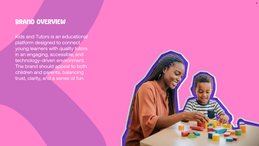
“From day one, we understood that Kids and Tutorswasn’t just building an educational platform — it was creating a trusted learning experience designed to inspire growth, connection, and confidence for both kids and parents.“
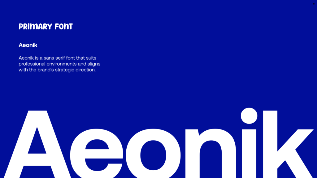
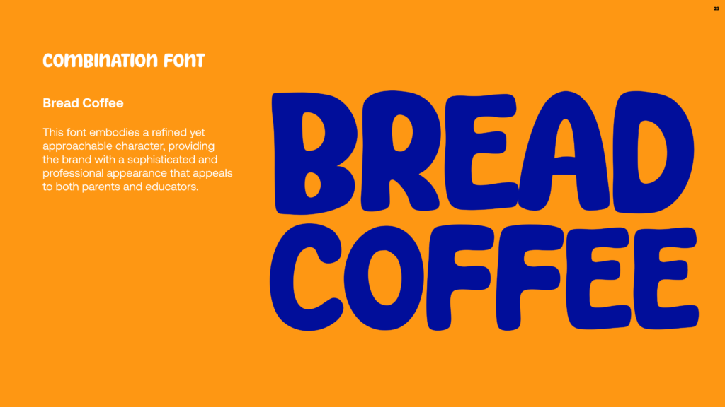
The visual identity was crafted to reflect trust, creativity, learning, and fun. Aeonik was chosen to deliver a clean and professional presence, while Breadcoffee adds a playful and engaging personality creating a balanced identity that appeals to both kids and parents.
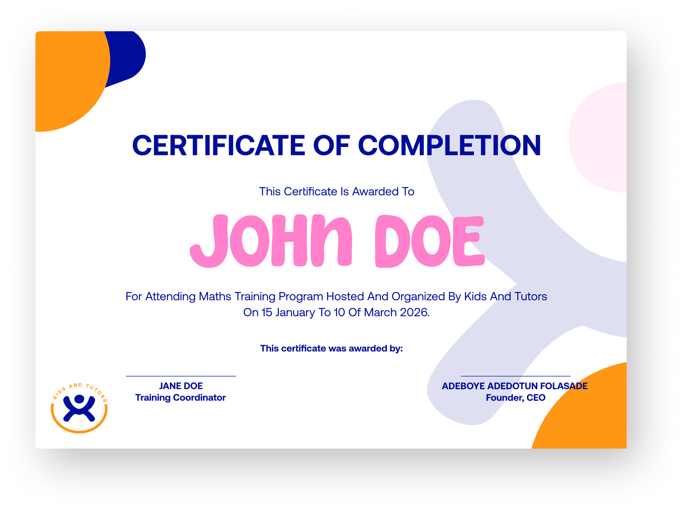
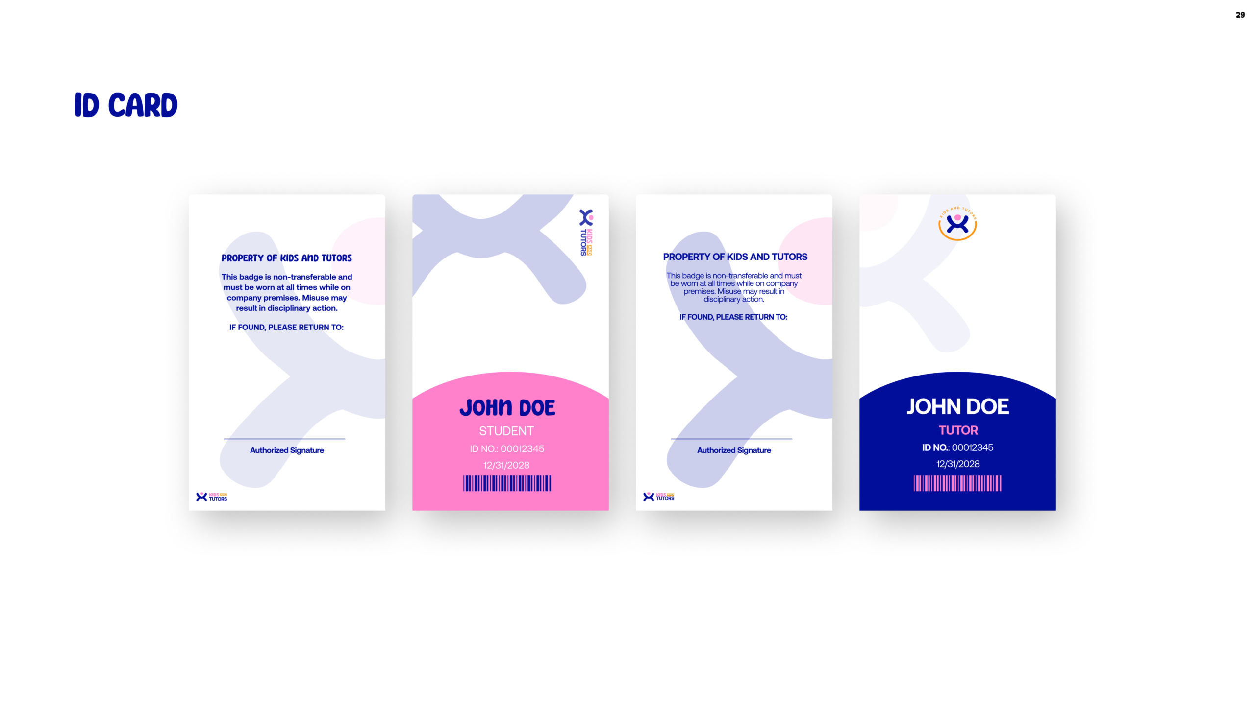
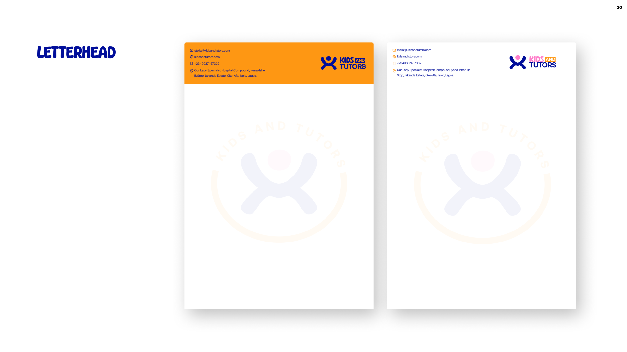
“To bring the brand to life, we extended the identity beyond the logo into practical and engaging brand touchpoints. From certificates and ID cards to professional letterheads and email signatures, every element was thoughtfully designed to create a cohesive, trustworthy, and memorable brand experience.”
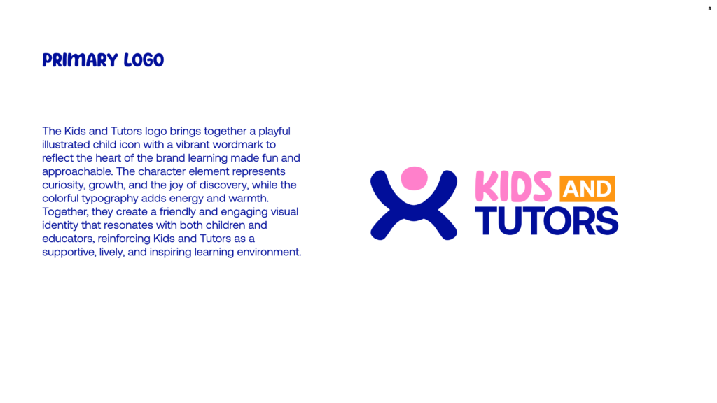
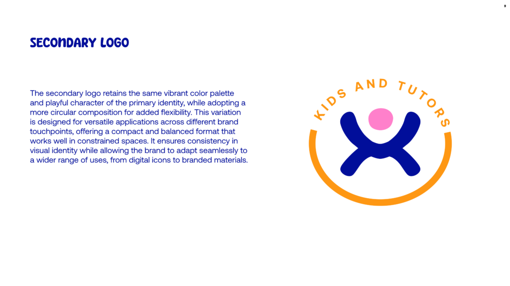
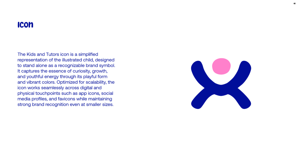
“We began with the logo, designed to reflect connection, growth, creativity, and trust balancing professionalism with a playful personality that resonates with both children and parents. The identity was created to feel approachable, engaging, and memorable while still maintaining a strong educational presence.
The color palette was intentionally selected to communicate warmth, fun, learning, and reliability bringing together vibrant tones that capture youthful energy alongside balanced colors that inspire trust and confidence.
Our typography and supporting brand elements extend this language further. Aeonik delivers a clean and modern professional feel, while Breadcoffee introduces a playful and friendly character allowing the brand to communicate effectively across both educational and family-focused touchpoints.
From certificates and ID cards to letterheads and email signatures, every design decision was made to create a cohesive identity system that feels engaging, trustworthy, and easy to connect with.
Because for us, this wasn’t just about aesthetics. It was about building a visual identity that supports learning, encourages growth, and creates meaningful connections between kids, tutors, and parents.”