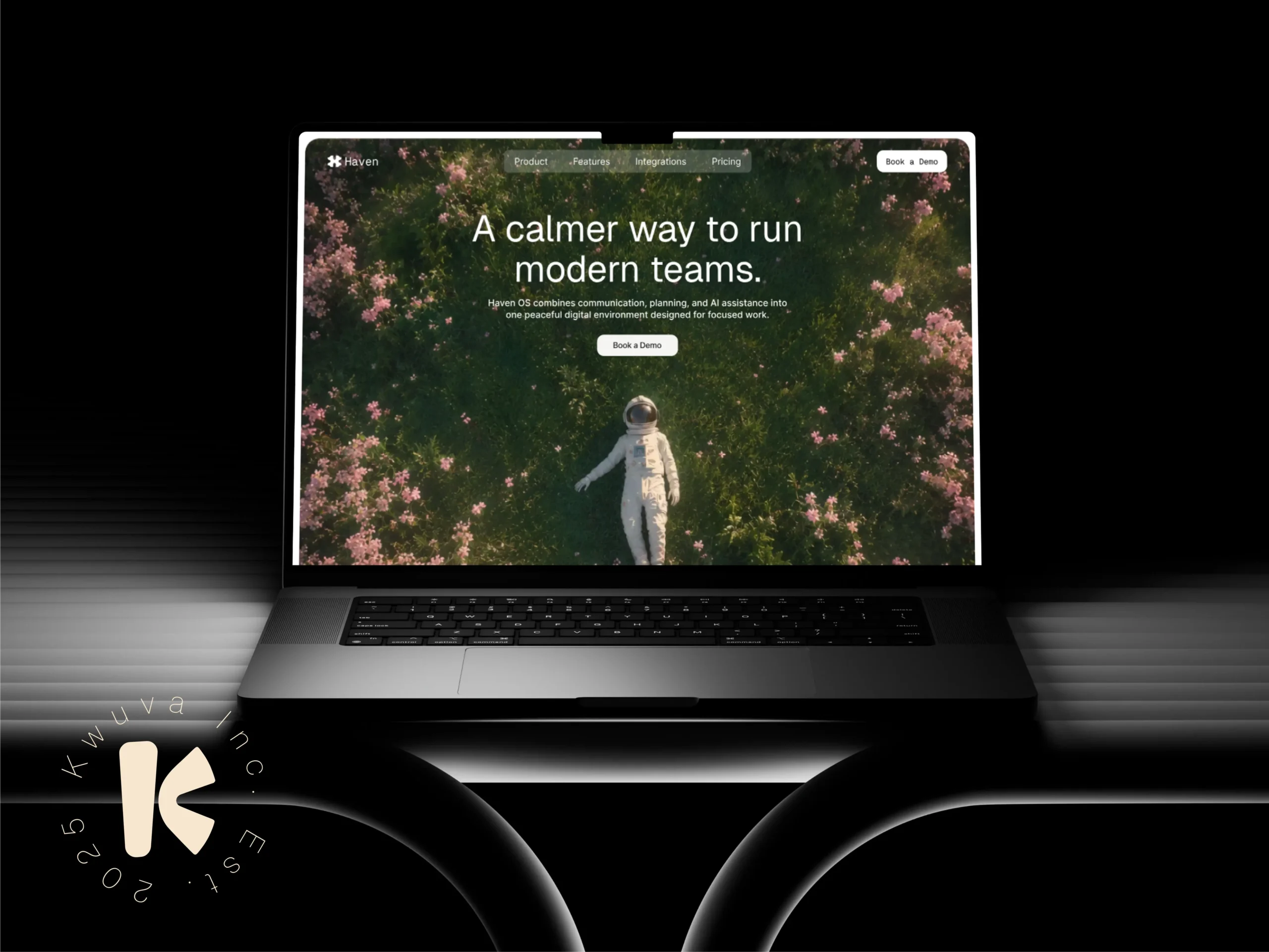
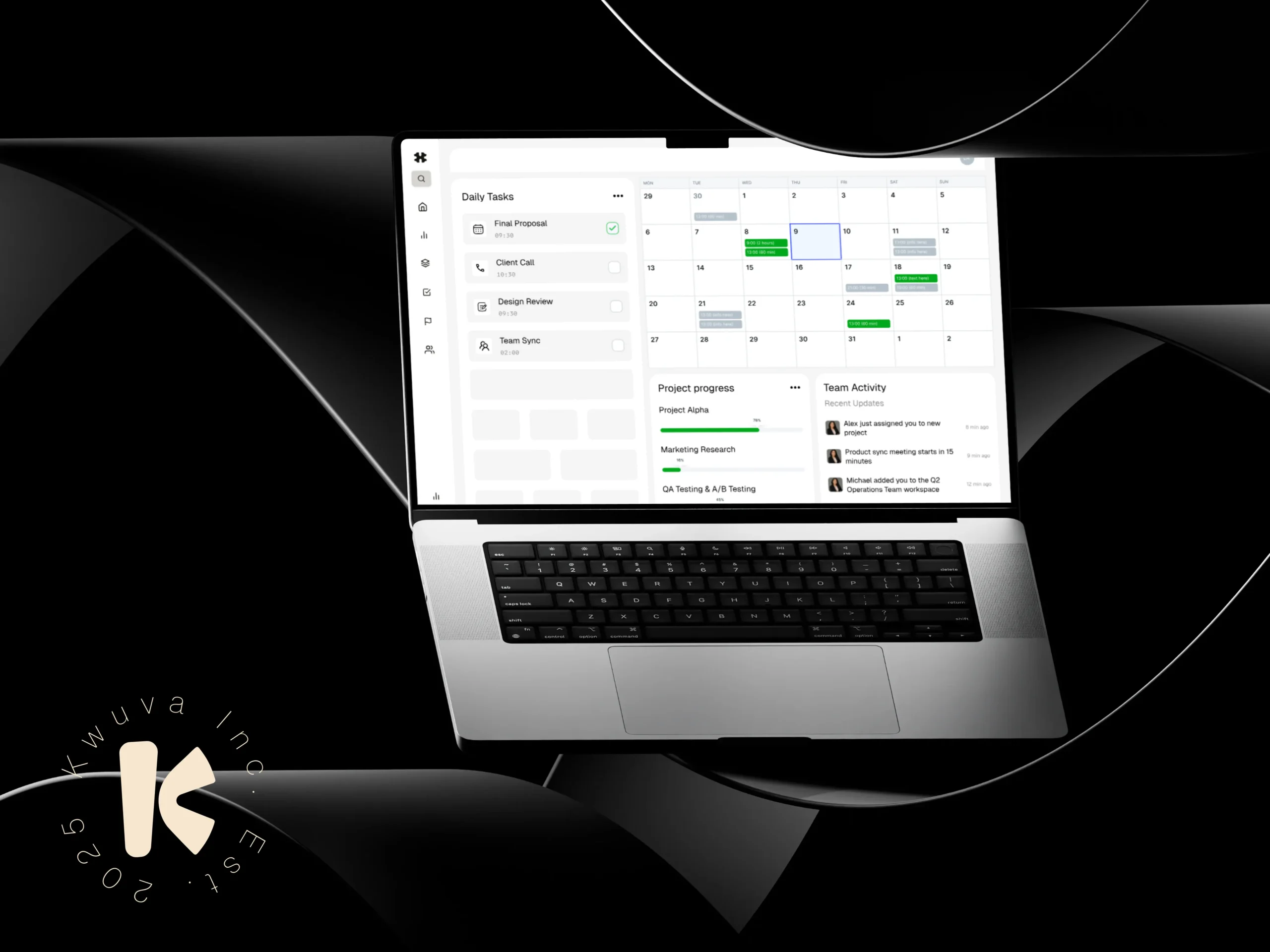
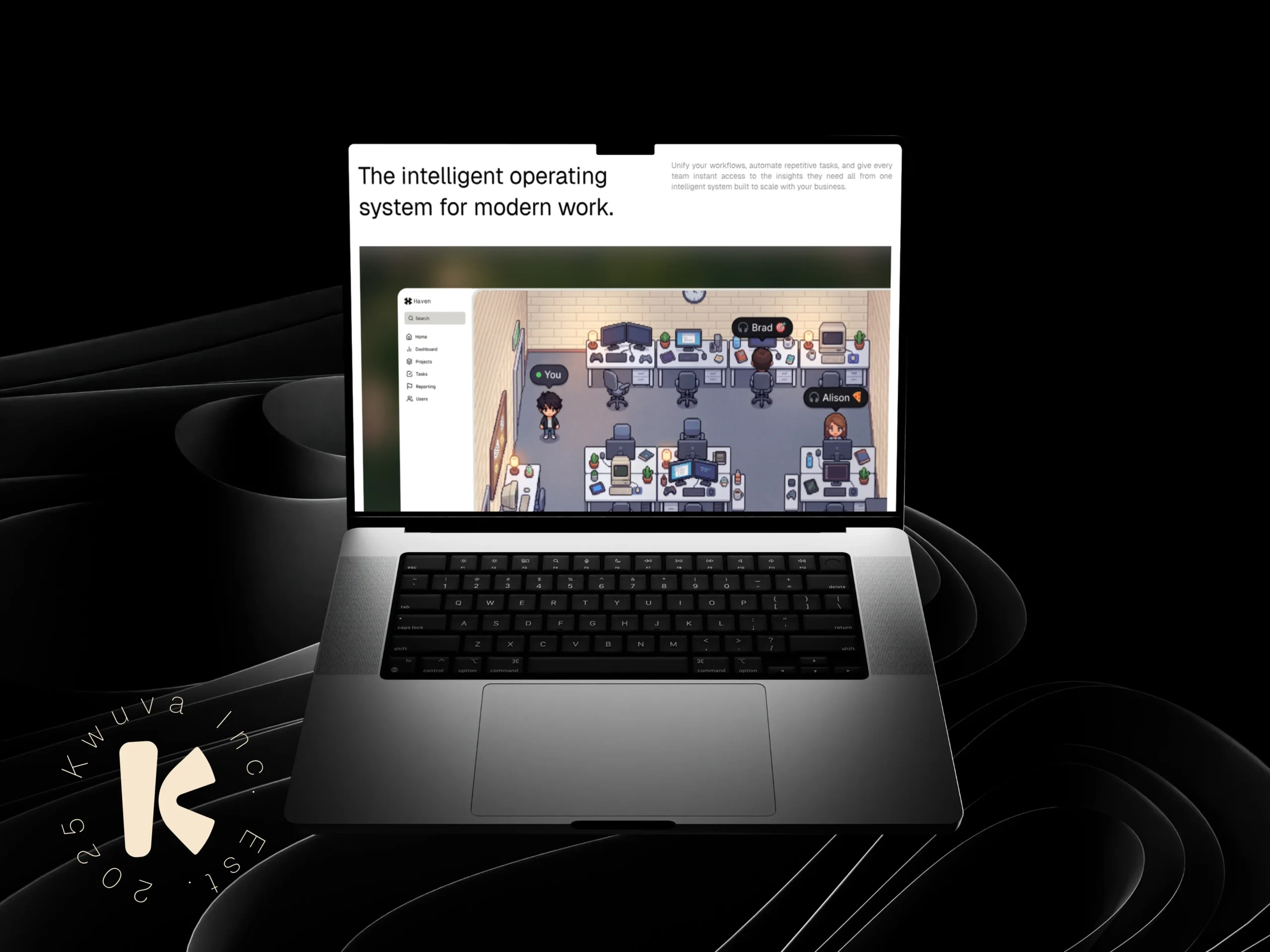
The modern workplace is overwhelmed — too many tools, too much noise, and too little clarity. AI-powered productivity software is growing fast, but most of it looks and sounds the same. Haven OS is building something different: an operating system for modern teams that prioritises calm, focus, and operational clarity over feature bloat and dashboard overload. We were brought in to define the full product design direction for Haven OS — from how it positions itself in a crowded market, to how it speaks, to how its landing page moves a reader from curious to convinced.
PROBLEM
We opened with a positioning sprint before any design or copy work began. The brief was simple: find the one idea that everything else could be built around. The anchor we landed on — “A calmer way to run modern teams” — became the creative brief that governed every downstream decision. From there, the work unfolded in layers: Positioning & Messaging — Tagline, section headlines, feature copy, and CTA language were all written against that single positioning anchor. Nothing made it in that didn’t serve the idea of calm, clarity, and focus. Page Architecture — We structured the page deliberately: Hero → Features → Social Proof → CTA → Footer. Each section was built to move the reader one step further into the product narrative, not just present information. Feature Rewrites — Eight feature sections were rewritten to shift from functional descriptions to felt benefits — what the product does versus what it actually changes for the person using it. Testimonial Framework — Testimonials were written and attributed to three distinct audience types: engineering-led teams, creative studios, and AI startups. This signals product breadth without stating it directly, letting the reader self-identify with the right voice. Illustration Direction & Prompt System — We developed a visual language direction and a prompt system for generating consistent illustration assets — giving the brand a scalable creative toolkit beyond the initial build. CTA & Footer Copy — Every exit point on the page was treated as a moment of commitment, not an afterthought. CTA and footer language was written to maintain the tone and close with intention.
OUR SOLUTION
We designed and developed a sleek, high-converting landing page experience for Qorix AI using Framer. The solution focused on combining modern visuals, strategic content structure, and clear conversion pathways to guide visitors toward booking a demo.
The landing page featured:
A clean and futuristic UI aligned with modern AI industry aesthetics
Clear messaging and compelling value propositions
Strategic call-to-action sections designed to increase demo bookings
A structured pricing section showcasing different plans and offerings clearly
Seamless integration with Calendly for easy free demo call bookings
Smooth animations and interactive elements to improve engagement
Fully responsive layouts optimized across desktop, tablet, and mobile devices
The final result was a premium, conversion-focused digital experience that not only positioned Qorix AI as an innovative technology brand, but also simplified the user journey from discovery to booking a consultation.
OUTCOME
1 Anchor Idea
A single positioning statement — “A calmer way to run modern teams” — that governed every creative and copy decision across the entire project.
8 Feature Sections
Fully rewritten to shift the language from product features to human outcomes, making the value of Haven OS immediately felt, not just understood.
3 Audience Voices
A testimonial framework built across engineering teams, creative studios, and AI startups — signalling market breadth without a single line of direct explanation.
Full System Delivered
Positioning, tagline, landing page copy, illustration direction, prompt system, testimonial framework, and CTA copy — a complete creative foundation ready to build and scale from.