
BACKGROUND
In outdoor advertising, true staying power comes down to trust and physical results. Since 2012, Destiny Media has been doing the real work on the ground—executing high-visibility billboard campaigns, transit advertising, and media rollouts for corporate brands, NGOs, and public institutions. After more than a decade of building an undeniable reputation entirely through performance and word of mouth, it was time for their public front to match the scale of what they actually deliver.
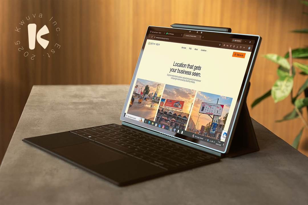
We were brought in to design and build Destiny Media’s official web platform: taking over a decade of hands-on industry authority and shaping it into an authoritative digital space that commands respect and moves media buyers from interested to convinced.
PROBLEM
When your business is putting up massive billboards and commanding attention across cities, people expect your brand to look just as bold and established.Destiny Media had the track record and the inventory, but everything lived offline. For years, clients only found them by driving past their boards or through direct referrals. That created a real hurdle for new business:
Marketing managers and brand teams couldn’t easily browse available ad formats or see past campaign work.
There was no clear way to see the full scope of their services—like roadshows, DOOH, and transit branding—all in one spot.
Booking a board or requesting a media quote took too much back-and-forth instead of a simple click.
Their work was out in the real world helping other brands get seen, but their own company had no digital footprint to back it up.
OUR SOLUTION
OUTCOME
We set a clear goal before any design or development work began: build a website that reflects the scale of outdoor advertising and turns visitors into direct campaign inquiries. Every detail—copy, layout, and visual tone—was tailored around that objective. From there, the work unfolded in layers:
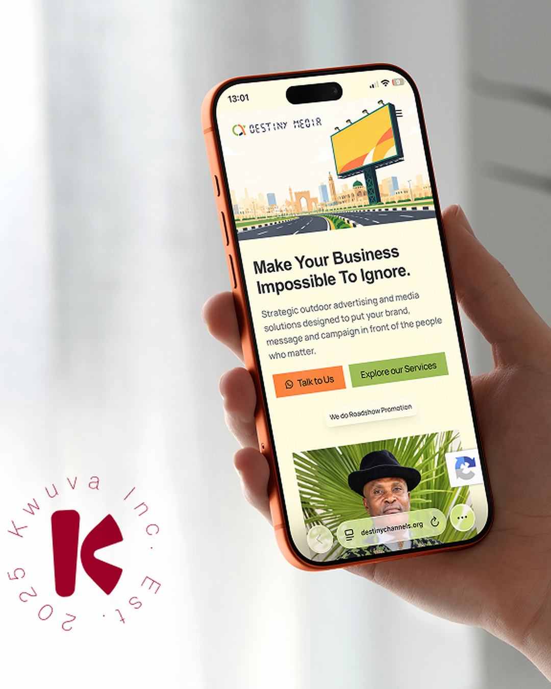
Positioning & Messaging — The hero section opens with a confident statement: Make Your Business Impossible To Ignore. The supporting copy positions their team as A Media Team Built To Help Your Business Scale, speaking directly to brands, government bodies, and NGOs.
Page Architecture — The page follows a clear flow: Hero → Mission & Authority → Services (01–07) → Brand Positioning → Target Audience → Direct CTA. Each section builds trust before asking for campaign details.
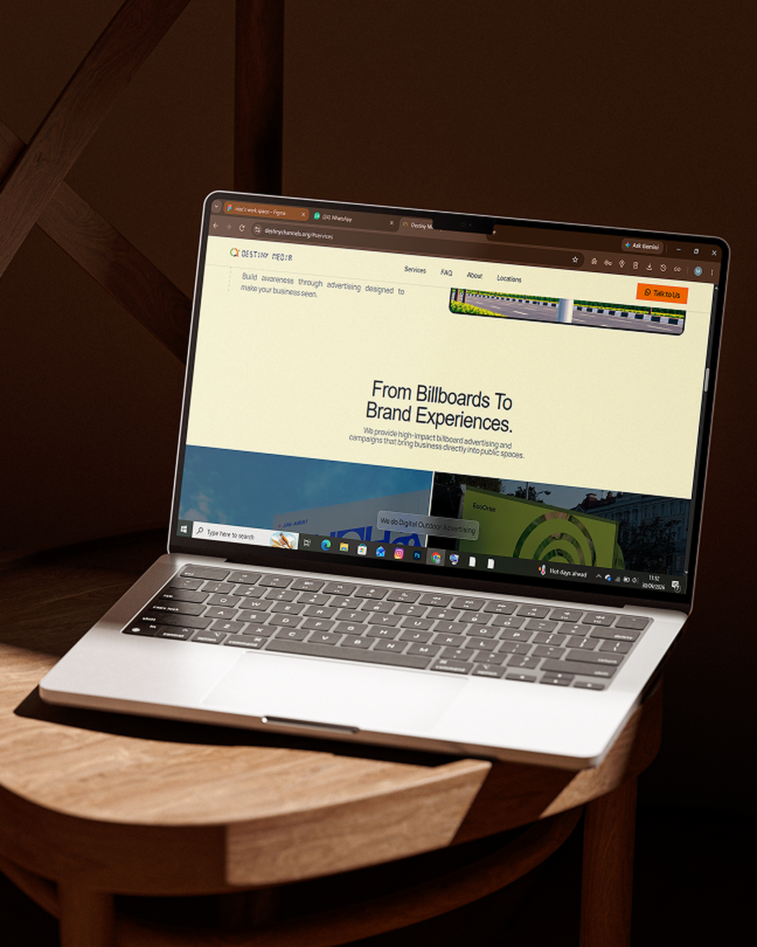
Service Clarity — Seven core offerings were organized into a numbered sequence (01 to 07): Billboard Advertising, Outdoor Media Campaigns, Product Promotion, Corporate Branding, Roadshows, DOOH, and Transit Advertising—giving buyers a clear view of their full reach.
Visual Context — Realistic billboard and signage mockups were integrated across the layout, giving prospects an immediate look at what their brand looks like at scale.
Institutional Credibility — Strategic sections showcase their ability to deliver large campaigns for corporations, government institutions, and NGOs.
Frictionless Inquiries — Streamlined quote triggers allow brand managers to request rates and site availability in just a few clicks.
The Build
We designed and developed a clean, conversion-focused website for Destiny Media that acts as a 24/7 sales channel for their outdoor inventory.
The website featured:
A bold hero section anchored by high-impact messaging and billboard mockups
A structured 01–07 service breakdown that simplifies every outdoor media format
Dedicated credibility blocks highlighting institutional and corporate capabilities
Strategic lead-capture pathways for fast quote and availability requests
Fully responsive layouts optimized across mobile, tablet, and desktop devices
The final result was a premium, conversion-focused digital experience that not only positioned Qorix AI as an innovative technology brand, but also simplified the user journey from discovery to booking a consultation.
1 Conversion Goal
Every section, layout choice, and call-to-action was built around one outcome: requesting campaign quotes and site availability. Nothing on the page exists without a purpose.
Core Service Pillars
A structured catalog categorizing everything from static billboards and transit wraps to digital outdoor displays and roadshows—giving media buyers an immediate view of full campaign reach.
Real-World Visualization
Photorealistic billboard mockups and outdoor environments integrated directly into the design, letting brands instantly picture their campaigns commanding physical space.
Full System Delivered
Brand strategy, persuasive copy, UI/UX design, custom mockups, and fully responsive layouts across mobile, tablet, and desktop—a complete digital storefront ready to capture briefs.