“We reimagined the identity of Henry’s Computer Home, creating a refined visual system that reflects the quality, trust, and professionalism behind more than 10 years of technology retail and support“
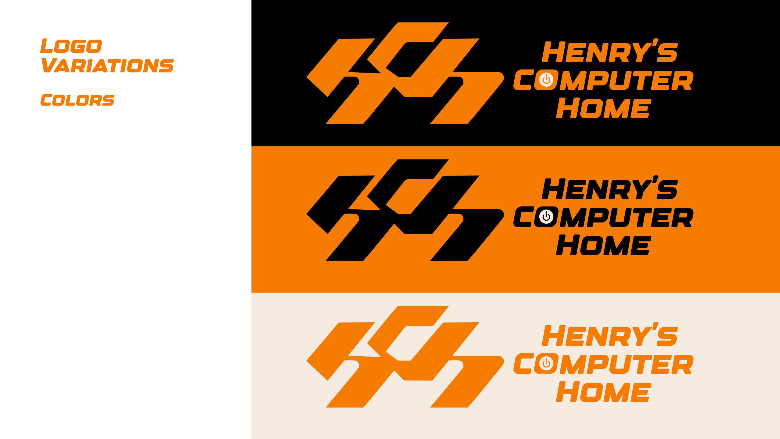
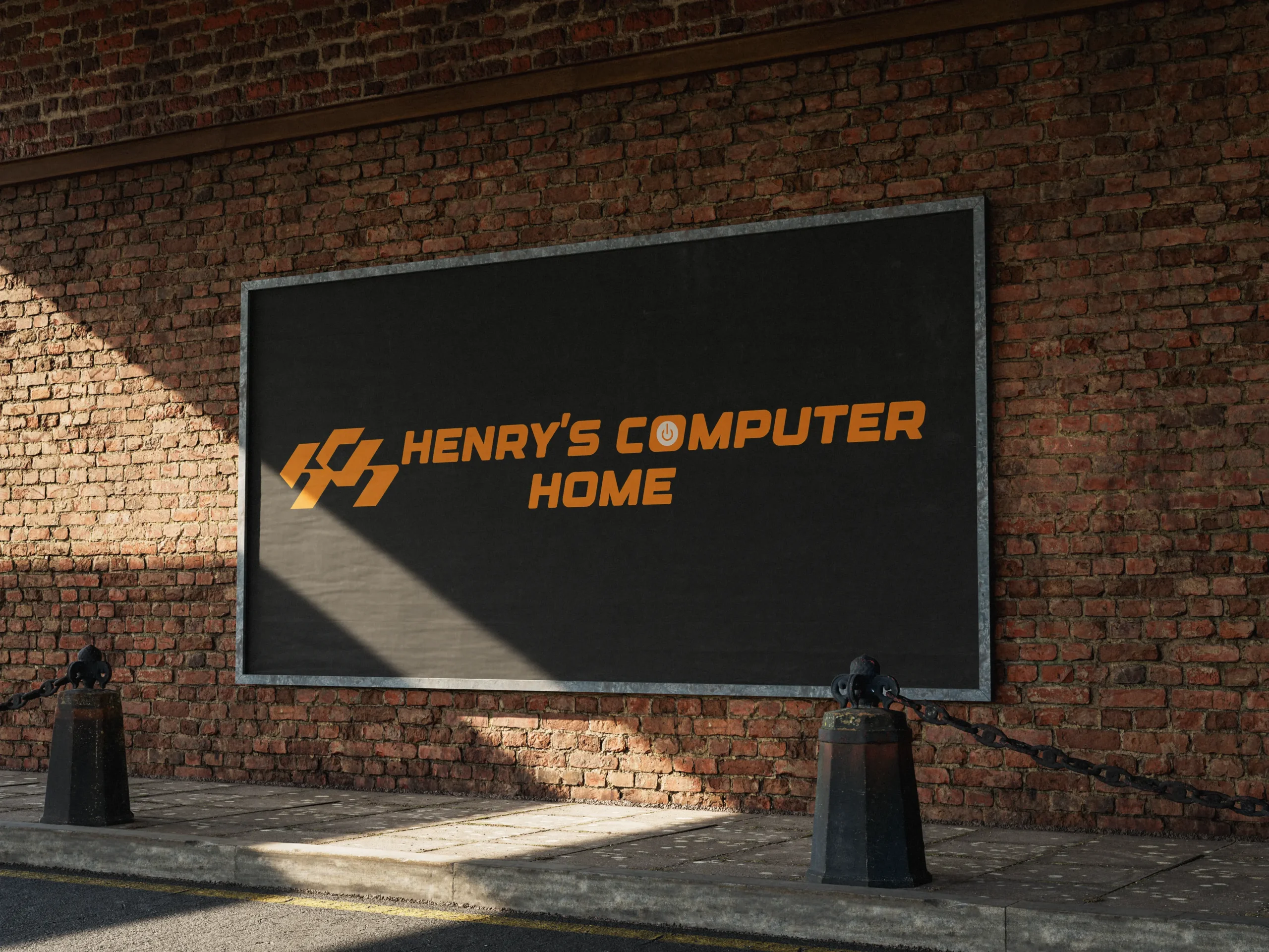
“The wordmark and symbol were crafted to reflect a modern technology company, using strong geometric forms and clean lines to ensure visibility, recognition, and lasting brand recall“
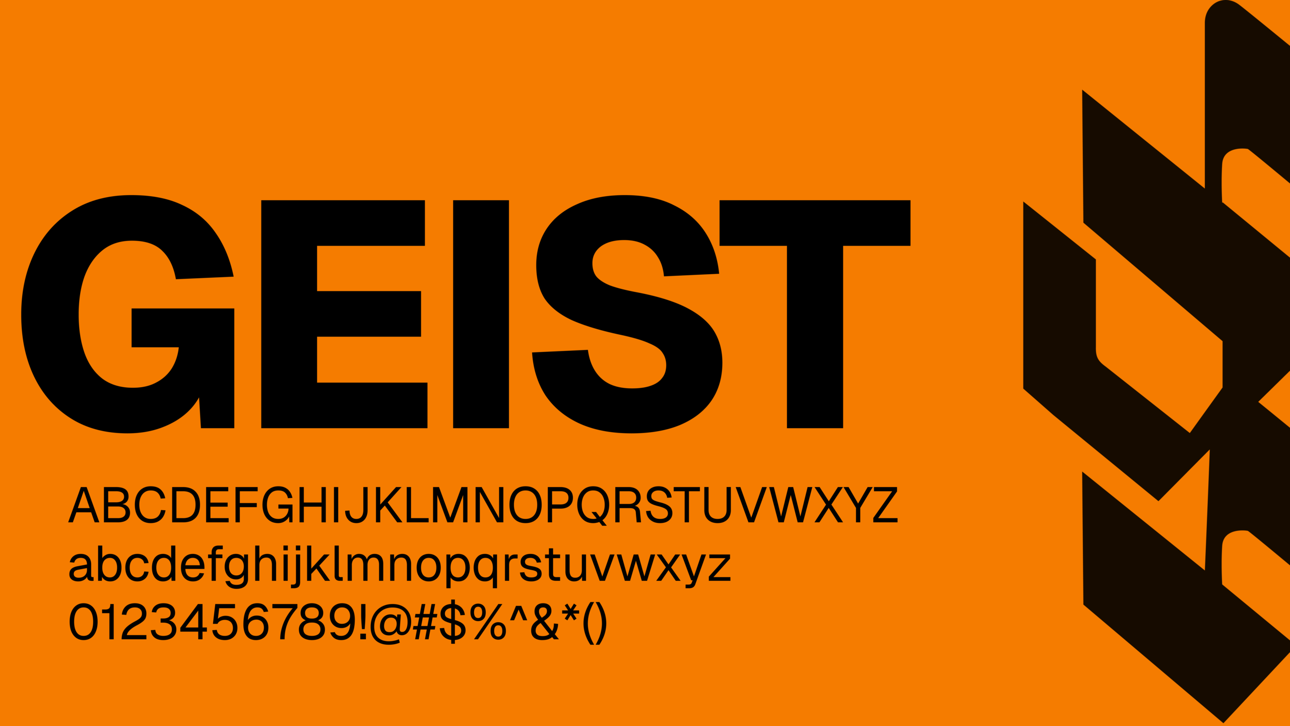
“The visual identity was designed to embody reliability, precision, and a modern outlook. Designer brings a bold and recognizable character to the brand, while Geist complements it with a clean, functional aesthetic, ensuring clarity and consistency across every touchpoint.“
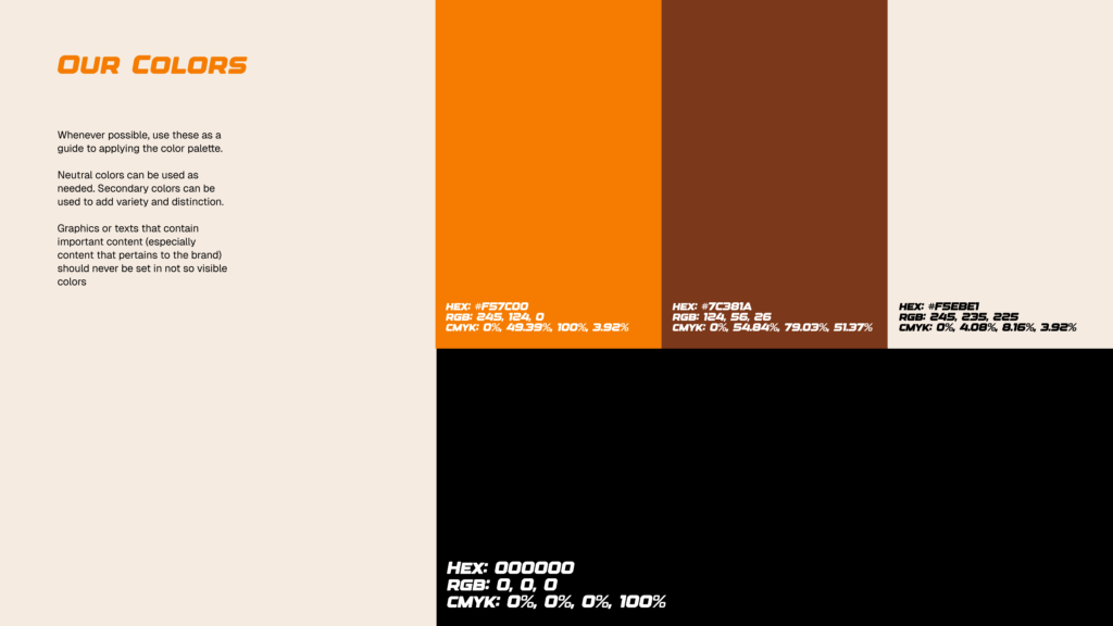
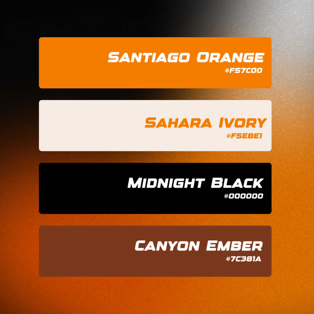
“We worked closely with the client to ensure their personality was reflected throughout the new identity. Drawing inspiration from their preference for orange, we developed Santiago Orange as the primary brand color, a vibrant yet rich tone that communicates energy, confidence, and warmth. It is complemented by Midnight Black, which adds depth and authority, and Sahara Ivory, a soft off-white that introduces balance and sophistication. Supporting the palette is Canyon Ember, an earthy secondary tone that brings warmth, character, and versatility to the overall brand experience.“
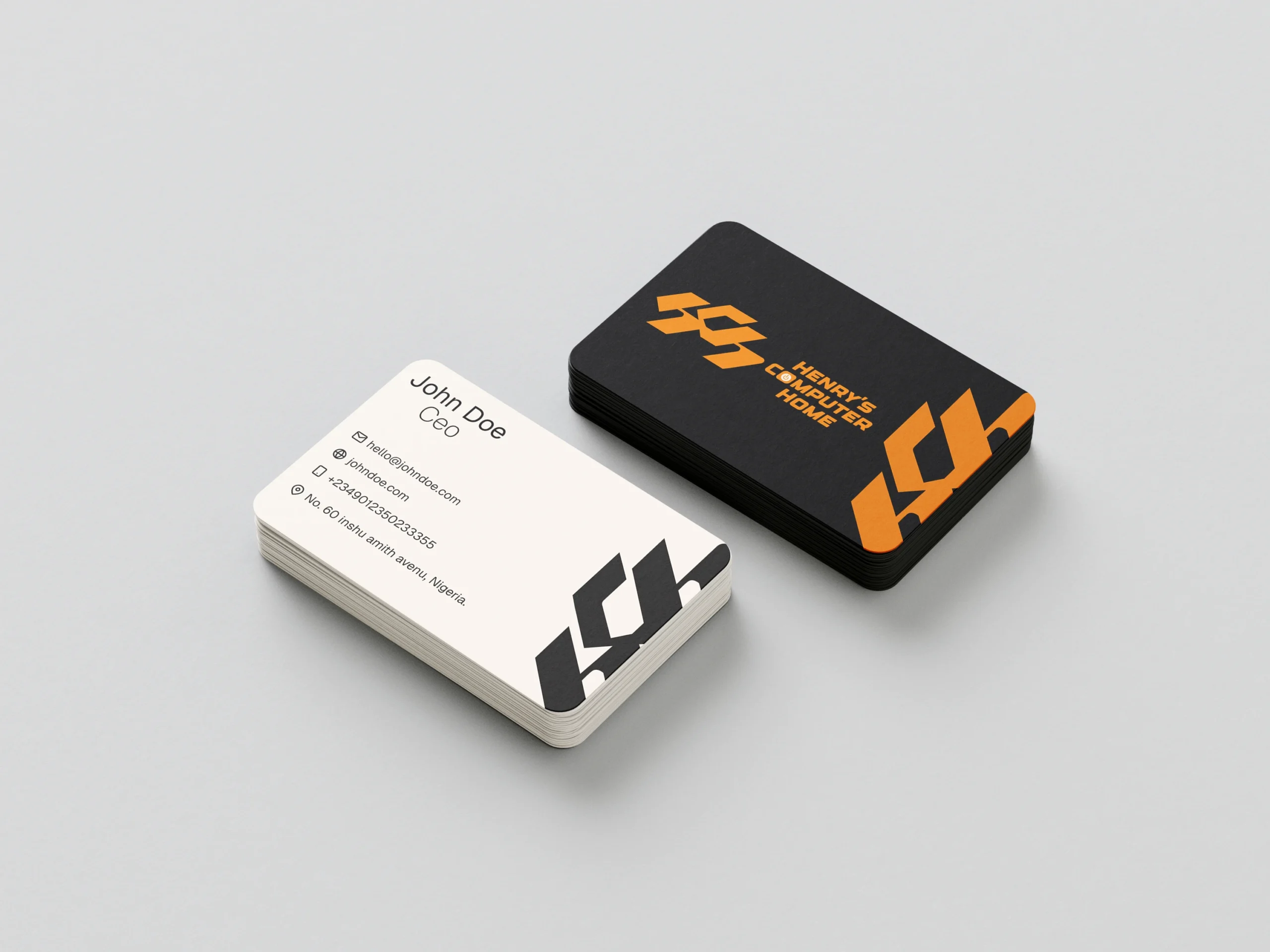
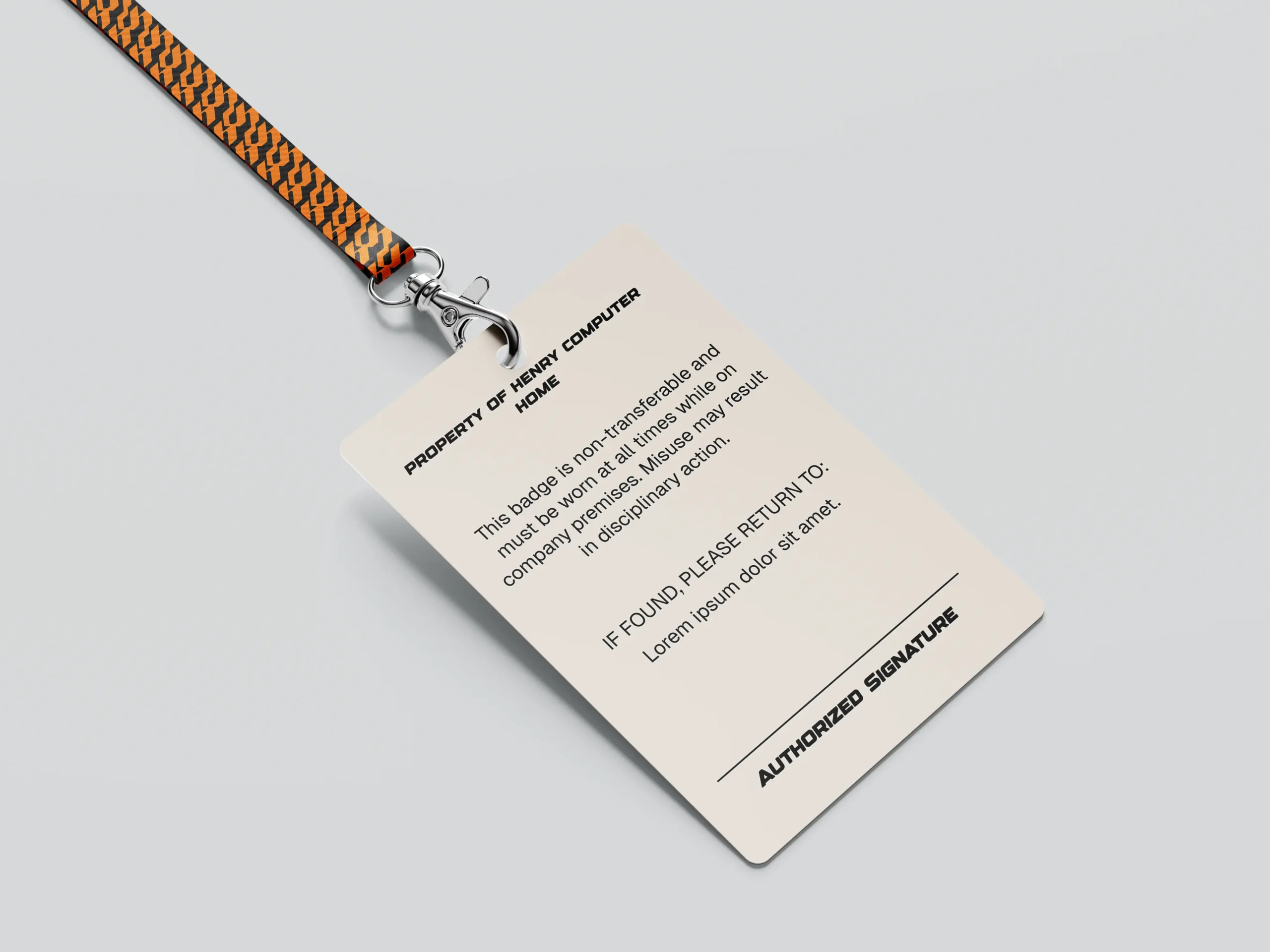
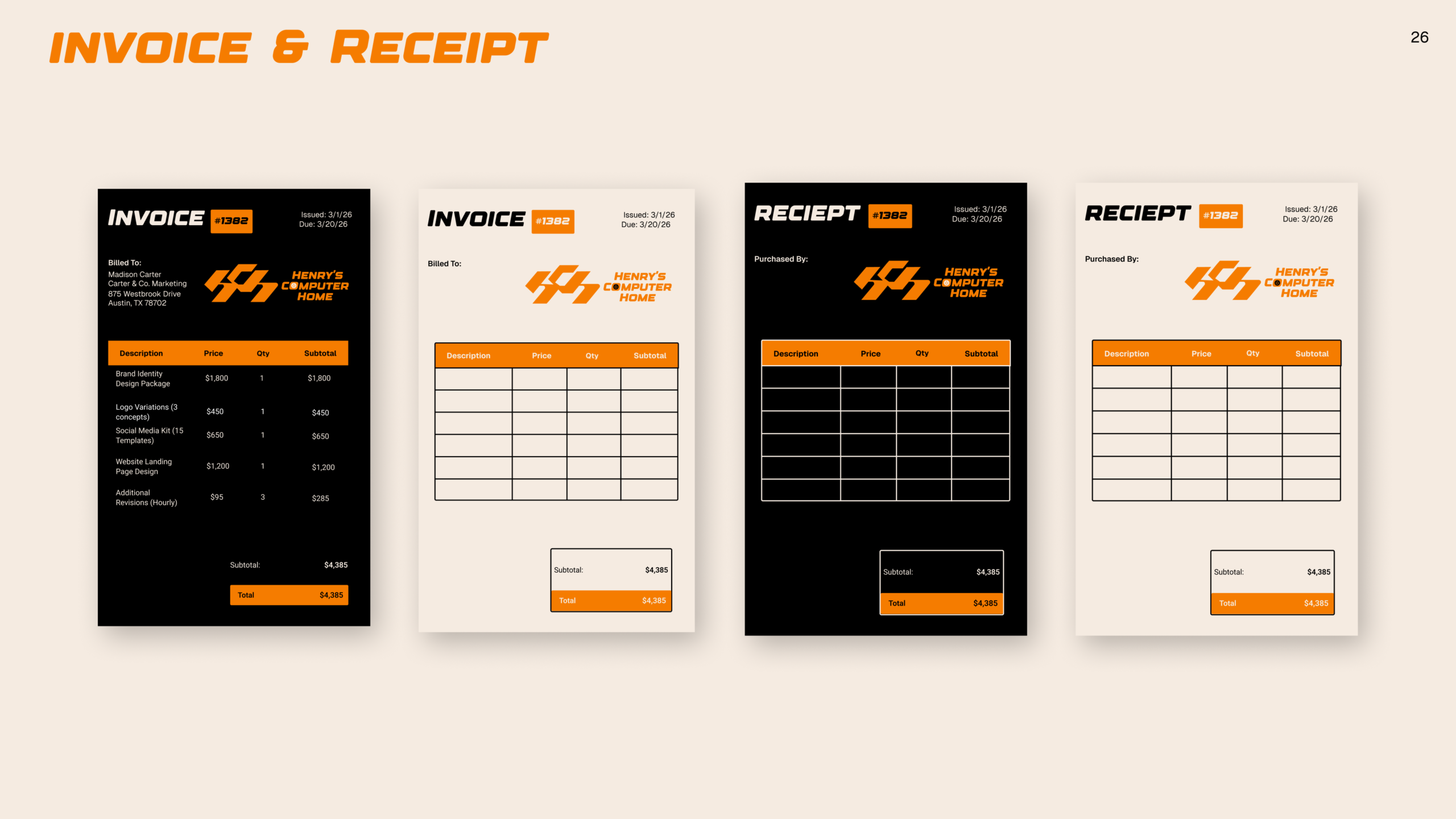
“We extended the identity across key brand assets, including ID cards and corporate materials, ensuring consistency and a polished presence at every touchpoint.“
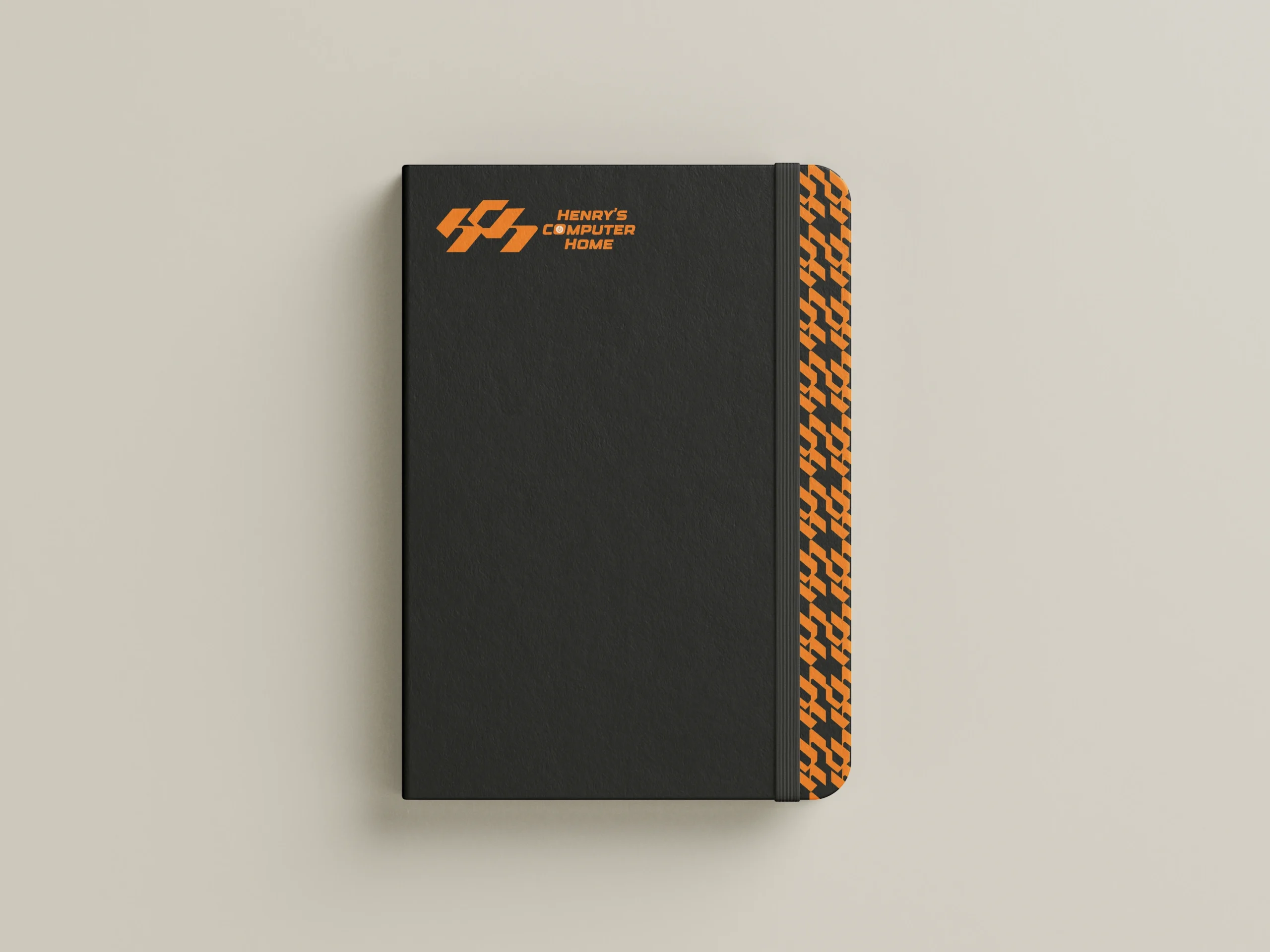
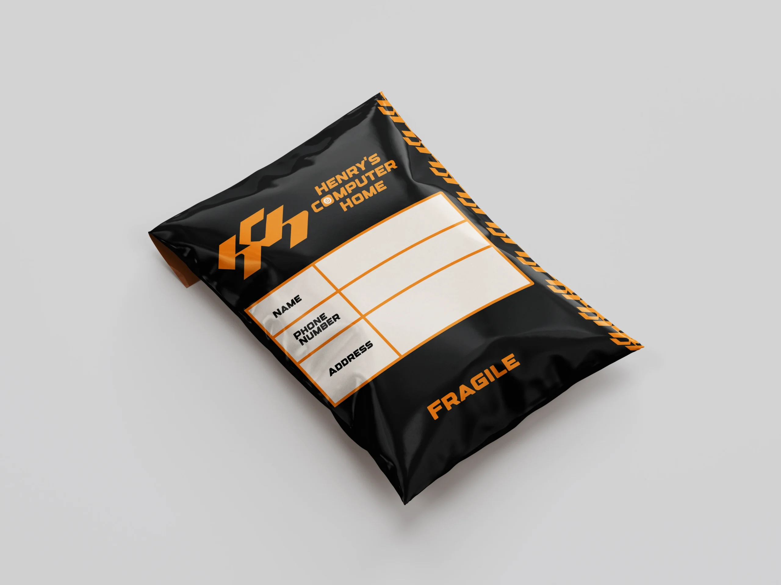
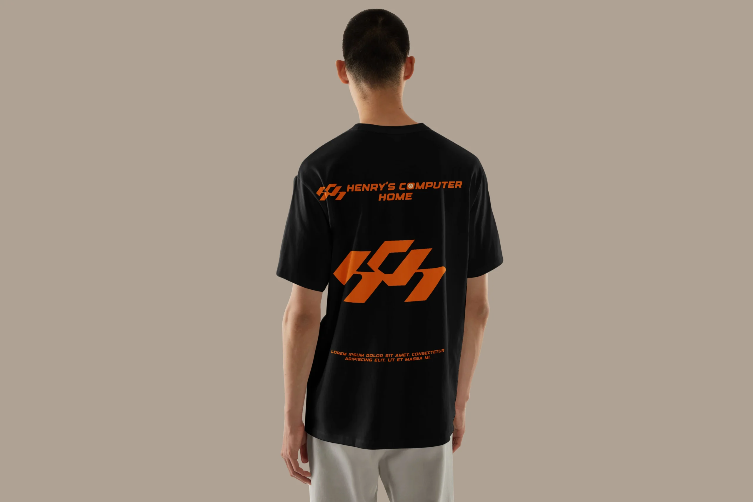
“Every element was designed to bring the identity to life beyond the logo.
From apparel and stationery to packaging and branded merchandise, each application was crafted to create a consistent and recognizable brand experience across every touchpoint.
Henry’s Computer Home — built for visibility, designed for consistency.